Wedding photos are the one photo category you'll look at 30 years from now. Choose the grade wrong and your daughter will one day say “why does everyone look so orange.” Here are 5 wedding photo grades that age well — meaning they still look right in 20 years, not just this season.
The failure mode: trend-following grades
Warm sepia Instagram-2015 wedding photos look dated by 2020. VSCO-A6 obsession from 2018 looks dated by 2022. Any grade that was hot for one wedding season is guaranteed to look dated by the next. The safer play is grades rooted in real photographic history — cinema, magazine editorial, quiet luxury — because those languages have already survived 30-50 years of trend cycles.
The 5 grades that age well
1. Golden Hour — for the outdoor ceremony
Warm sun, long shadows, that magic hour. It's the photographic reference every romantic ceremony wants to be. Use for outdoor ceremonies, sunset portraits, the walk down the aisle if it's outdoors. The Classic preset is the safest choice. Beach preset for beach weddings specifically.
Tool: /golden-hour. Ages well because golden hour has been the reference for romance photography since the 1920s.
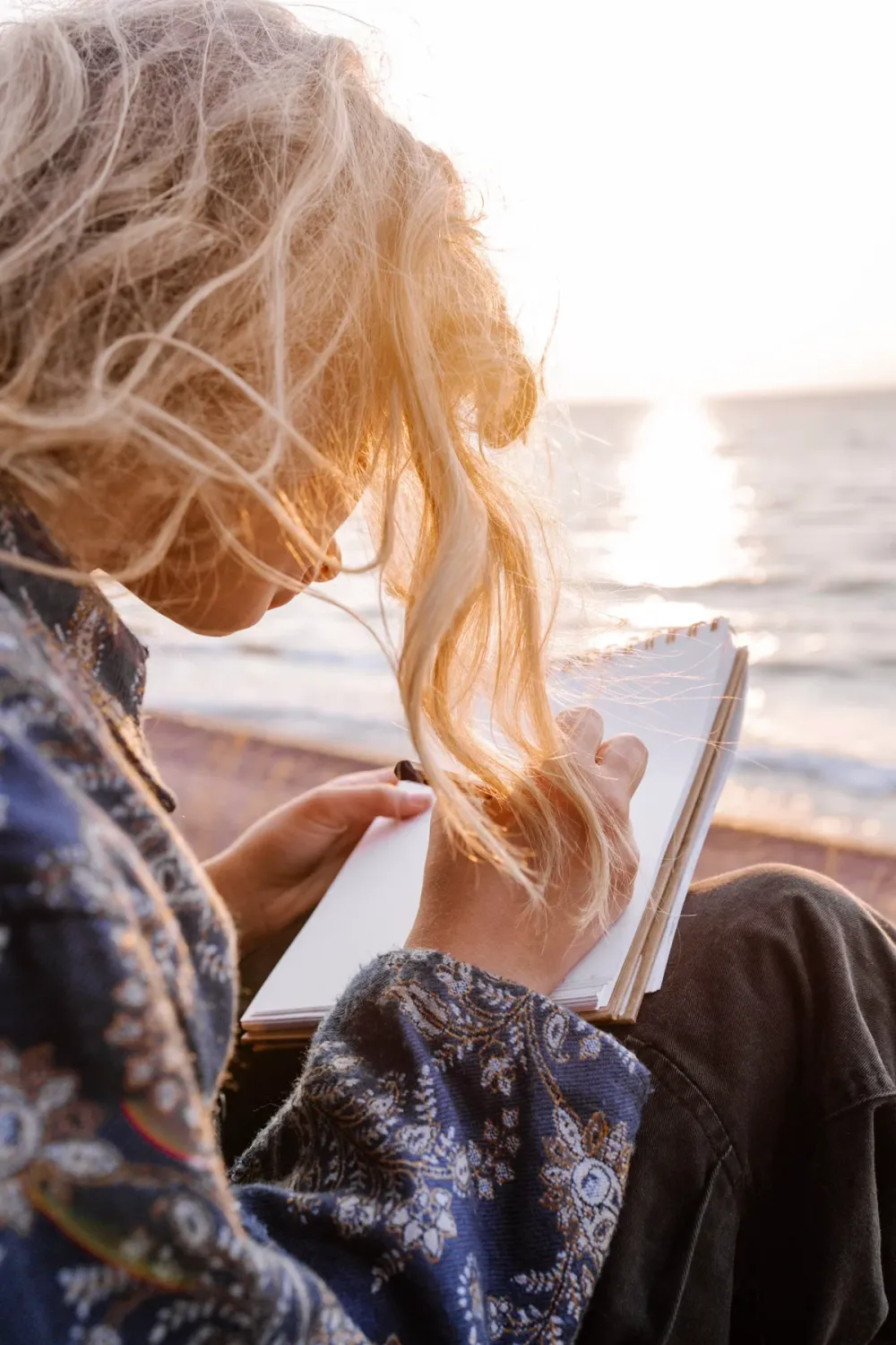
2. Soft Cinema — for the first look and getting ready
Peach cast, gauzy bloom, romantic haze. Greta Gerwig and Sofia Coppola made this a permanent addition to the cinematic canon. Use for the bride getting ready, the first look, quiet emotional moments. Priscilla preset for extra pink romance. Lady Bird for more diaristic.
Tool: /soft-cinema. Ages well because soft romantic cinema is a language, not a trend.
3. Cashmere Warmth — for the reception
Warm cream, dim ambient, considered restraint. This is the quiet-luxury / old-money aesthetic applied to your reception — warm without being orange, atmospheric without being dark. Use for reception dinner tables, dance floor, cake cutting. The Evening Amber preset for candlelit dinners specifically.
Tool: /loro-piana. Ages well because the quiet-luxury photography school predates the 2023 trend by 20+ years (Ralph Lauren has shot this way since the 90s).
4. Sun Flare — for the couple portraits
Real lens flare, sunbeam streaks, warm bloom. This is what wedding portrait magazines have been printing for 40 years. Use for outdoor couple portraits — the flare adds atmosphere without changing the color of skin tones. Corner Flare preset is the classic wedding move.
Tool: /sun-flare. Ages well because flare is real optics, not a trend filter.
5. A24 Editorial — for the reception details
Cool teal, lifted blacks, restrained saturation. Perfect for the details — table settings, flowers, invitations, shoes, rings. Aftersun preset (no letterbox) keeps it detail-focused without cinema drama. This grade signals “considered wedding” without loudness.
Tool: /a24-editorial. Ages well because indie cinema restraint is now permanent visual vocabulary.
The wedding-day workflow (30 minutes edit for 300 photos)
Don't apply one grade to all photos. Different moments deserve different grades. Recommended split:
- Ceremony (outdoor) → Golden Hour
- First look / getting ready → Soft Cinema
- Couple portraits → Sun Flare + Soft Cinema stacked
- Reception atmosphere → Cashmere Warmth
- Reception details → A24 Editorial
Batch by scene, not one-by-one. 300 photos → 5 batches → 30 minutes total edit.
What to avoid
- Y2K / Party grades on wedding photos — these are trend photos, not archive photos. Will look dated fast.
- Neon Tokyo / Festival on receptions — same reason. Save those grades for content, not archives.
- Heavy grain on all photos — grain works on some (Golden Hour, Soft Cinema) but overuse reads as forcing the look.
Final tip: whichever grade you pick, download in full resolution PNG and archive the originals separately. In 30 years the archive matters more than this year's grade.