A24's films share a visual language so consistent that screenshot any frame of Past Lives, Aftersun, Moonlight, or Everything Everywhere All At Once and you'll recognize the grade. It's not just “indie” — it's a specific set of color choices, and they're the opposite of the warm saturation Hollywood blockbusters use.
The three defining choices
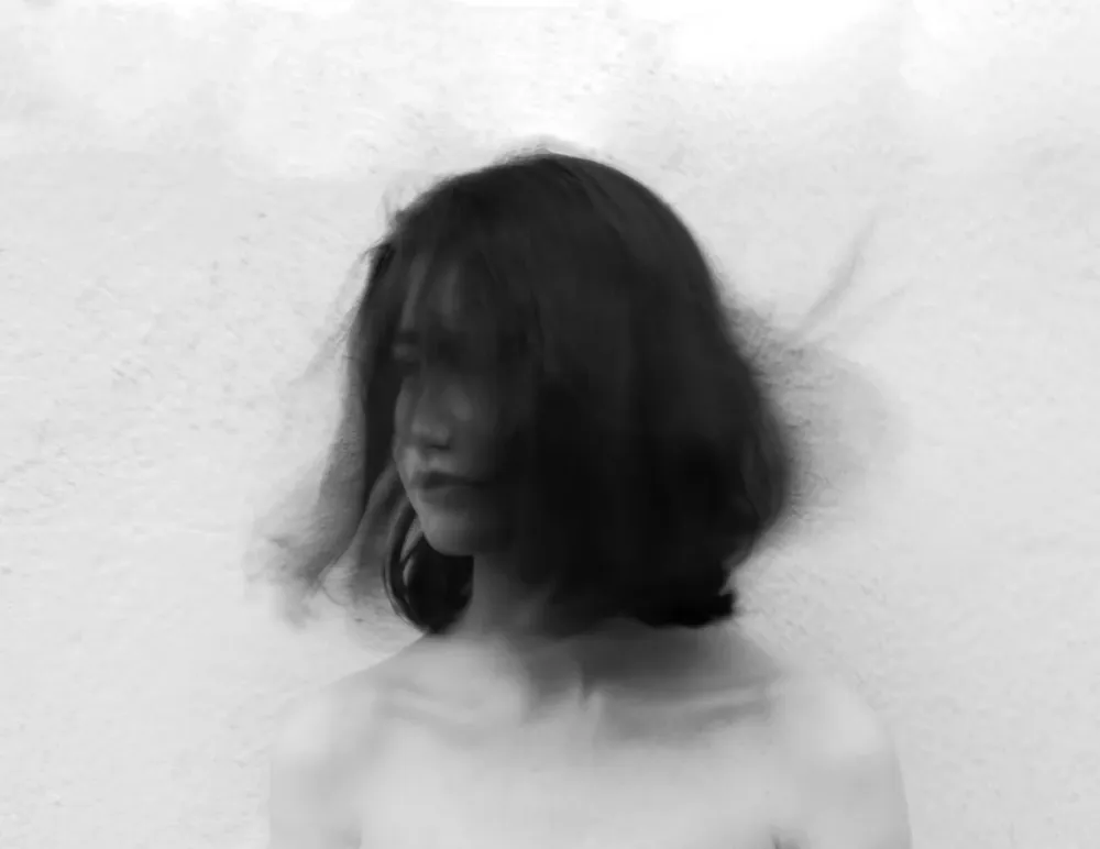
1. Cool teal cast
Mid-tones shift toward blue-green. Slight cyan creeps into highlights. The result is a quiet, considered atmosphere — never screaming for attention. Compare to a Marvel film, where everything is orange-teal contrast pushed to maximum. A24 inverts the formula.
2. Lifted blacks
Hollywood crushes shadows for drama. A24 lifts shadows toward mid-grey. The result feels more like memory than cinema — softer, more lived-in. It's why Aftersun feels diaristic instead of dramatic, even though the emotional weight is enormous.
3. Restrained saturation
Colors hold but never push. The image feels considered, not enhanced. Past Lives in particular reads almost desaturated by modern standards — which is exactly why it feels modern.
Why this look became a cinema generation's signature
A24 (founded 2012) emerged at the same moment indie cinema began rejecting Hollywood's saturation arms race. Greta Gerwig, Barry Jenkins, Charlotte Wells — directors who came up in the 2010s — all leaned cool, lifted, restrained. The grade became synonymous with quality storytelling, not because it's objectively better but because it signals deliberate craft.
Why it photographs so well as a still
The cool, considered palette also happens to work in photos. Lift the shadows of a window-lit portrait, push the teal slightly, desaturate just a touch — and a phone snapshot starts to read as film still. The visual restraint translates directly to social media because it feels different from the saturated maximalism of most feeds.
The shortcut
Stacking all three choices manually requires a color grading workflow. PixMojo's A24 Editorial tool bakes them into four film presets (Past Lives, Aftersun, EEAAO, Moonlight) with optional 2.35:1 letterbox. Browser only.